This short introduction traces how the art on each volume turned into a visual story cue for readers. The jujutsu kaisen manga wrapped its run with chapter 271, and the December 25 release of volume 30 made every volume cover available for collectors and new fans alike.
Volume 1 set the tone by pairing Yuji Itadori with Ryomen Sukuna, their bond hinted by blood and a marked hand. That single image foreshadowed a long arc of tension, growth, and conflict.
Across thirty volumes, artists used color and composition to hint at themes like justice, transformation, grief, and resolve. Bright greens, bruised reds, and stark blues recurred to build a recognizable visual grammar for the series.
In this guide, we’ll map how each volume cover evolved with the story and its characters. Expect readable analysis, clear takeaways, and a collector’s view of why these images matter.
Why JJK manga covers captivate: style, symbolism, and story in sync
The series’ covers act like visual foreshadowing, compressing plot beats into a single, charged image. In the jujutsu kaisen world, a volume can signal tone, danger, or calm before the storm. Each piece communicates where the story sits within a larger arc.
Gege Akutami’s eerie palette and dynamic contrasts
Gege Akutami pairs bold, uncanny colors with stark lighting. Bright, playful tones sit beside bruised violets and arterial reds. This shift is clear from the Goodwill Event to the Shibuya Incident pages.
How covers foreshadow arcs and character turns
Anatomy becomes shorthand: hands and face details act as narrative devices. Yuji’s palm, Mahito’s warped form, and Kenjaku’s exposed brain all hint at possession, change, or loss of control.
“A single volume image communicates mood, stakes, and a place in the story.”
- Color = emotional temperature.
- Gesture = upcoming conflict or reveal.
- Motif = legal, spiritual, or personal symbolism.
| Element | Example Volume | Meaning |
|---|---|---|
| Color shift | Vol. 14–16 | Chaos and escalation |
| Anatomy focus | Vol. 15, 16 | Possession, identity |
| Symbol motif | Vol. 19 | Justice and rebirth |
The result is cinematic shelf presence: each volume cover hints at a character beat and invites readers into the larger narrative world.
How we picked the most striking volume covers
We prioritized volume art that tells a clear story at a glance, where a single image can signal a turning point. Selection focused on images that foreshadow techniques, betrayals, or power shifts tied to the plot.
Criteria were simple and strict:
- Clear link to the wider jujutsu kaisen world or a key arc.
- Visual motifs that echo a character’s inner conflict or growth.
- Compositions that gain new meaning on a reread.
Standout picks include Vol. 4, where Gojo lifts his blindfold during the Kyoto goodwill event and hints at Hollow Purple. Vol. 17, titled Perfect Preparation, echoes Zen’in clan tensions. Vol. 30 closes the run with Yuji’s domain gesture after the final chapter, as all 30 volumes became available after the December 25 release and the series ended at chapter 271.
“Good cover art acts like a prologue: brief, suggestive, and impossible to ignore.”
| Selection Factor | Example Volume | Why it matters |
|---|---|---|
| Narrative foreshadowing | Vol. 4 | Signals Hollow Purple and Kyoto Goodwill Event stakes |
| Clan & character tension | Vol. 17 | Reflects Perfect Preparation and Zen’in conflict |
| Series closure | Vol. 30 | Emphasizes Yuji’s final gesture and thematic payoff |
The beginning and the end: Yuji Itadori bookends that frame the series
The first and last volumes act like visual parentheses around one character’s journey. These two images compress a long tale into clear emotional beats. Together they show how the central drama moved from inheritance to choice in the story.
Volume 1 — Yuji and Ryomen Sukuna entwined, blood and fate on display
Volume 1 braids yuji itadori with ryomen sukuna at the series’ center. The design places a lurking hand behind Yuji and Sukuna’s mark on his palm, while a smear of blood ties them together.
The sickly green backdrop and tight framing sell danger at a glance. That first cover sets expectations for a brutal initiation into this world.
Volume 30 — “From Now On,” Yuji’s domain gesture and Buddha imagery
Volume 30 flips the view: Yuji stands looking down, his hand shaped in a Domain-like gesture. The Buddha behind him suggests moral arrival and the calm after trials that included pressure from the king curses.
Placed beside Volume 29, these final covers reward collectors and close the loop. The two-volume pairing traces posture, color, and resolve from fearful inheritance to chosen resolve.
“A pair of covers can compress years of plot into two decisive images.”
Fan-favorite spotlights: Satoru Gojo, Ryomen Sukuna, and more
Iconic volume art often freezes a character’s peak moment into one unforgettable frame. These three volumes became fan landmarks because each image signals a turning point in tone and stakes.
Volume 4 — Gojo lifts the blindfold, Hollow Purple foreshadowed
Satoru Gojo appears mid-action with his blindfold pulled aside and fingers linked. The single hand gesture hints at Hollow Purple before the Kyoto Goodwill Event unfolds. That volume cover reads as a promise: the strongest will reveal power when it counts.
Volume 14 — Sukuna’s “Right and Wrong” devastation stance
Volume 14 frames Ryomen Sukuna as devastation personified during the Shibuya crescendo. The pose and the subtle smear of blood sell moral collapse and the king curses’ cold intent. This image helped define the series’ darkest mid‑arc beats.
Volume 25 — Inhuman Makyo Shinjuku showdown’s Megumi‑Sukuna fusion
Volume 25 vaults the stakes by showing Sukuna wearing Megumi’s form — the fusion fans call “Meguna.” The inhuman makyo shinjuku moment and makyo shinjuku showdown visuals make the threat feel final. It’s a late‑game, confident taunt that ties older iconography to the endgame.
- Volume features like a tilted grin, a linked finger, or stained cloth say more than pages can.
- These three images show how a single pose can make characters and scenes into lasting fandom touchstones.
“A single frame can announce technique, betrayal, or the narrowing of the jujutsu world.”
Shibuya Incident visual language: transformation, gates, and dread
In this arc, visuals turn ordinary streets into thresholds where bodies and identities are rewritten.
Volume 15 — Mahito’s mangled form mirrors a world in flux
Volume 15 shows Mahito in a twisted, reshaped body. The image signals sweeping change for Itadori and Kugisaki. The cover makes the curse feel like chaos made flesh.
Volume 16 — Kenjaku in Suguru Geto’s body, exposed brain and priestly menace
Volume 16 literalizes possession: Kenjaku lifts skin to reveal a brain. Red-and-white fields read like blood and ritual. The face and gesture make the takeover feel clinical and cruel.
Volume 11 — Nanami’s measured resolve amid “Gate Open” chaos
Volume 11 provides a stoic counterpoint. Nanami adjusts his glasses with a calm face. His posture reads as moral steadiness inside the city’s panic.
“Akutami’s marker strokes and chromatic noise turn terror into texture, so the city itself feels on the brink.”
- The three volumes escalate dread with surgical precision.
- Mahito = curse as chaos; Kenjaku-as-Geto = desecration; Nanami = professional resolve.
- Together they map thresholds where gates open, and identities blur.
| Volume | Key image | Visual meaning |
|---|---|---|
| 15 | Mahito mangled | Transformation, identity remade |
| 16 | Kenjaku in Suguru Geto | Possession, ritual desecration |
| 11 | Nanami adjusting glasses | Measured resolve amid collapse |
In short: these covers form a triptych that captures the Shibuya Incident’s dread. They mark gates in the jujutsu kaisen world where lines between life and death shift.
Goodwill to grudge: school events and their cover tone shifts
A festival or match at jujutsu high can act like a stage where secrets step into the light.
Volume 5 — Kyoto sister school goodwill event, Todo and Takada’s playful flair
Volume 5 brightens the page with Aoi Todo and Nobuko Takada. The school goodwill event vibe shows poppy hearts and playful energy.
The playful cover underlines how camaraderie and rivalry coexist before darker beats arrive.
Volume 7 — Origin of Obedience and the cursed womb brothers
Volume 7 pivots hard. Choso, Eso, and Kechizu appear and the tone grows ominous.
The composition reads like a warning to the jujutsu society, showing how quickly a friendly event becomes a battleground.
“Event-centric storytelling can flip from sports-day antics to existential stakes without losing character charm.”
- Vol. 5 captures levity at the sister school goodwill meet.
- Vol. 7 reveals the cursed womb brothers and darker aims.
- The pair proves how event scenes animate the school setting as training ground and stage.
| Volume | Key image | Tone |
|---|---|---|
| 5 | Todo & Takada, hearts | Playful |
| 7 | Cursed womb brothers | Ominous |
| — | Event contrast | Shifts mood fast |
Before the fall: Hidden Inventory and Premature Death prelude
Before the series’ moral fracture, two volumes quietly map the moments that shift power and belief.
Hidden Inventory and Premature Death act as a short, sharp prelude. Together they set tone and stakes for what follows.
Volume 8 — Toji Fushiguro’s armory and cold hues signal upheaval
The volume 8 cover centers Toji with his Inventory Curse visible. Weapons crowd the frame while dark splatters hint at sudden violence.
Cool purples and toxic greens give the image a predatory calm. This palette reads like a warning: balance is fragile and might snap.
Volume 9 — Suguru Geto’s descent anchors the series’ moral fracture
Volume 9 (Ch. 71–79) places suguru geto at the moment his convictions curdle. The cover frames a turning point that echoes through the entire arc.
The two images work as a pair: one shows a weaponized past, the other shows a mind choosing a darker path. Together they explain how a single choice ripples into later conflict.
“The art reads like a dossier on cause and effect—how one character’s resolve becomes another’s downfall.”
- Volume 8 establishes a chill before the storm: weapons, cool tones, and predatory calm that unsettle satoru gojo’s world.
- The palette’s deep purples and greens visually whisper that the calm will not hold.
- Volume 9 foreshadows choices that break the moral spine of the story.
| Volume | Key image | Meaning |
|---|---|---|
| 8 | Toji with Inventory Curse | Upheaval, predatory calm, sudden bloodshed |
| 9 | Suguru Geto’s descent | Moral fracture, seeds of later conflict |
For readers and collectors, these two cover images are required context. On reread, they turn hindsight into a richer view of the series’ long arc.
Culling Game revelations: courtroom sunflowers and rebirth
Two volumes inside the Culling Game arc slow the action to examine conscience and consequence. Their art swaps crossfire for legal and personal symbols that ask readers to pause and interpret.
Volume 19 — Hiromi Higuruma
Sunflower, law, and a calm that unsettles
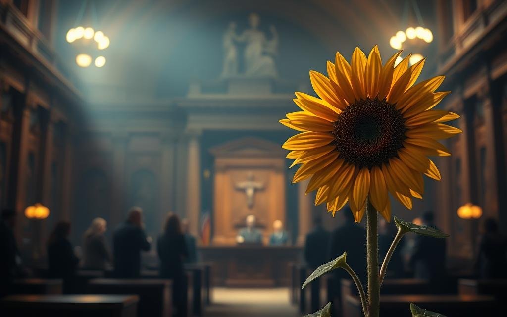
Volume 19 frames Hiromi Higuruma against a blue-sky calm, a wilted sunflower in hand. The flower ties to Japanese legal symbolism and turns a lawyer into a player inside the Culling Game.
The visual reads like a courtroom spilled into the arena: justice under siege, a calm face that masks pressure, and a motif that makes first-time viewers do a double take.
Volume 22 — Maki Zenin
Scars, Split Soul Katana, and a pinky promise
Volume 22 marks “Rebirth.” Maki’s scars, the Split Soul Katana, and Mai’s pinky promise appear as proof of cost and resolve.
The image turns personal vows into battlefield rules. The hands in the frame emphasize a pact, while visible damage signals transformation that demanded sacrifice.
“These two volume features act like case files: one argues law and motive, the other records a vow paid in blood.”
- Volume 19’s legal motif pushes courtroom language into the jujutsu society.
- Volume 22 celebrates a painful reset—new neutrality, new purpose.
- Together they widen the story from character struggle to systemic reckoning.
| Volume | Key image | Meaning |
|---|---|---|
| 19 | Higuruma with sunflower | Justice on trial in the jujutsu world |
| 22 | Maki’s scars & pinky promise | Rebirth, cost of conviction |
| — | Pairing effect | From individual conscience to broader reckoning |
Inhuman Makyo Shinjuku, Shinjuku Showdown, and the endgame’s icons
Two late volumes trade spectacle for ritual, turning battlefield motifs into quiet, operatic iconography.
Volume 28 presents Yuta posed at the center with Rika looming behind him. The design splashes blood like punctuation across his form. That palette nods back to Volume 0 and highlights the promise ring as a small, painful emblem of vow and cost.
Volume 28 — Yuta and Rika’s bond, blood-spattered elegance
The cover refines late-game elegance: Yuta steadies while Rika’s presence reads as protective and tragic. Colors recall his origin story and reward longtime readers tracking his arc.
Volume 29 — Heian-era Sukuna, cross-shaped slashes and yellow threads
Volume 29 enthrones the king curses in Heian regalia. Sukuna’s stomach mouth and cross-shaped gestures hint at Slashes or Fire Arrow. Yellow threads tie him visually to Yuji, binding legacy and threat.
Together these images crystallize the inhuman makyo shinjuku mood and set the stage for a makyo shinjuku showdown. The sequence feels ritualistic, intimate, and operatic.
“Placed beside the finale, these volumes act as the drumroll before the last act.”
- Volume 28 puts Yuta in the emotional center with blood-splatter motifs.
- Volume 29 casts Sukuna as regal menace with cords that bind fate.
- For collectors, these volume features show late-era polish and dense symbolism.
JJK manga covers
A subtle grammar of color, hands, and faces threads through the line, turning each volume into a visual sentence.
Color theory, hands, and faces: recurring motifs across volumes
Gege Akutami uses palette to anchor emotion: icy greens signal dread, cobalt blues sharpen focus, and saturated reds jolt the eye on a bookstore shelf.
Recurring hands—raised palms, linked fingers, and grasped weapons—act like punctuation. Faces, framed tight or pulled back, read as confession or command.
Look for deliberate echoes: Gojo’s lifted blindfold (Vol. 4), Geto/Kenjaku’s exposed brain (Vol. 16), Sukuna’s “Right and Wrong” posture (Vol. 14), and Higuruma’s sunflower (Vol. 19).
From bookstore eye-catchers to narrative artifacts
Each volume cover works as marketing and memory. A single glance recalls technique, betrayal, or a turning point in the story.
As a series, the set matures: innocence fractures, ideals harden, and the jajutsu society—the jujutsu society—shows its contradictions in full color.
“One image can be both portrait and prophecy.”
| Motif | Example Volume | Meaning |
|---|---|---|
| Color cues | Vol. 4, 14, 19 | Emotion, tone, arc punctuation |
| Hand gestures | Vol. 4, 25 | Control, consent, technique |
| Character spotlights | Vol. 16, 14 | Identity, possession, prophecy |
Collector’s corner: building a volume cover set that tells the whole story
Build a display that reads like a timeline: each spine and face should mark a turning point in the story.
Start with high-impact pairs—place Vol. 1 and Vol. 30 together to frame Yuji’s arc. Then add the late-game triptych (Vol. 28–30) for a finale-focused vignette.
Curate by theme. Pick justice (Vol. 19), rebirth (Vol. 22), devastation (Vol. 14), and possession (Vol. 16) to create a mini-museum of the jujutsu society’s moral tensions.
If shelf space is tight, choose one face from each era: prelude (Vol. 8 or 9), school rivalry (Vol. 5), urban collapse (Vol. 14 or 16), and endgame (Vol. 28 or 29).
Mix portrait covers with action scenes for visual rhythm. Protect prized pieces with sleeves and consistent framing; strong inks and bold contrast reward careful lighting and display time.
| Display Strategy | Example Volumes | Why it works |
|---|---|---|
| Bookend pair | Vol. 1 & Vol. 30 | Frames character growth and final gesture |
| Finale triptych | Vol. 28–30 | Condenses endgame themes and ties legacy |
| Thematic mini-museum | Vol. 14, 16, 19, 22 | Highlights devastation, possession, justice, rebirth |
“Arrange by arc and era so the shelf tells the story at a glance.”
Conclusion
Volume 30 brings the jujutsu kaisen visual cycle to a close, wrapping a long, image-driven journey in a single, confident pose.
The set of covers maps the story across time and tone. Each image pushes the narrative forward while rewarding careful viewing.
Yuji Itadori’s arc and the looming threat of the king curses frame how character and consequence shaped design. The final gesture, like earlier detail, turns a simple spine into a lasting piece of the series’ history and reminds collectors why a well-made cover can feel like more than a wrapper — it is part of the tale.
FAQ
What makes the volume artwork for Jujutsu Kaisen so striking?
Gege Akutami uses a limited, eerie palette and bold contrasts to create tension. The artist pairs symbolic props — hands, faces, blood, and timepieces — with dynamic poses to hint at character arcs and emotional stakes. The result reads like a visual prologue that draws readers into each book’s story.
How do covers foreshadow events like the Shibuya Incident or the Culling Game?
Covers often encode plot beats through motifs and color shifts. During the Shibuya Incident arc, imagery emphasizes transformation, gates, and dread — warped forms, exposed brains, and broken geometry. For the Culling Game, symbols such as sunflowers and courtroom backdrops signal judgment and rebirth, preparing readers for the arc’s thematic focus.
Why are Yuji Itadori’s first and latest volume images important?
Yuji’s bookend covers frame the series’ emotional journey. Early art pairs him with Ryomen Sukuna to underline fate and blood ties, while later images — like the “From Now On” motif — show a changed posture and symbolic elements (Buddha-like gestures) that reflect growth and consequence.
Which volumes highlight Satoru Gojo and Ryomen Sukuna best?
Several stand out: Gojo’s moment of lifting his blindfold foreshadows his Hollow Purple prowess, while Sukuna’s volumes capture his layered menace — from devasting stances to classical, Heian-era echoes. These covers place them at the center of the series’ mythic tone.
What visual themes appear in the Goodwill Event and sister-school arc?
The goodwill arc shifts tone toward rivalry and spectacle. Covers use playful color accents and character-driven poses — think Todo and Takada’s energy — but also introduce darker elements like cursed wombs, signaling an undercurrent of menace beneath the tournament vibe.
How do prelude volumes signal looming tragedy or character ruin?
Early warning comes through colder hues and utilitarian imagery. Toji Fushiguro’s armory-focused cover, for example, uses steel tones to suggest imminent violence, while Suguru Geto’s descent is shown through isolating composition and moral fracture cues, hinting at betrayal and fallout.
What motifs recur across the series’ spine and center designs?
Color theory, the prominence of hands, partial faces, and symbolic objects repeat across volumes. These motifs work as visual anchors that link disparate arcs, turning individual books into parts of a cohesive narrative tableau collectors can read at a glance.
Are there specific covers tied to the Inhuman Makyo Shinjuku Showdown?
Yes. Volumes tied to Makyo Shinjuku and the Shinjuku Showdown lean into blood-spattered elegance, fusion motifs, and urban-demonic iconography. These images emphasize clash and consequence, often spotlighting fused forms or decisive stances.
How can collectors assemble a set that tells the whole story?
Build a collection that follows release order to preserve narrative progression. Focus on pivotal volumes: opening and closing bookends featuring Yuji, Shibuya Incident entries, Culling Game highlights, and character-centric issues for Gojo, Sukuna, and Maki. This approach creates a visual timeline that mirrors the series’ evolution.
Do cover designs change after major events like Shibuya or the Culling Game?
Yes. Major events often shift tone, palette, and motif choices. Post-Shibuya imagery grows darker and more fractured, while Culling Game covers explore rebirth and legalistic symbolism. These shifts reflect the world’s altered stakes and character transformations.
Which volumes best convey the emotional core of key side characters?
Select volumes spotlighting characters like Maki, Megumi, and Hiromi Higuruma use focused symbolism: Maki’s rebirth imagery and scarring, Megumi’s fusion moments during Makyo Shinjuku, and Higuruma’s sunflower justice motif. Each cover distills personal arcs into a single, powerful image.
How does color theory support storytelling on the spine and front?
Color choices set mood instantly—cold blues for loss, saturated reds for violence, and muted tones for moral ambiguity. Designers balance contrast to guide the eye toward faces, hands, or symbolic objects, making the covers function like visual chapter titles.
Are bookstore variants or special editions worth seeking out?
Special editions often add alternate colorways, center-spine art, or exclusive motifs that deepen a volume’s theme. For collectors, these variants can highlight different facets of a story or character and enhance the set’s narrative cohesion.
